8
\$\begingroup\$

I noticed the syntax highlighting on CR was different than that on SO:

Stack Overflow

Syntax highlighting isn't perfect - the blue and the red could be a little brighter, but overall it's fairly representative of what we have in our IDE's and it's "good enough":
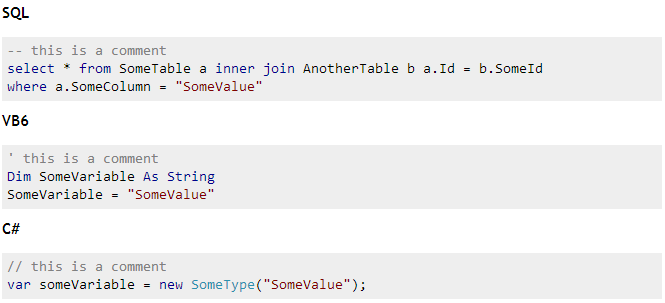
StackOverflow Syntax Highlighting

(oops just noticed I forgot the on keyword in my inner join stub...)

Code Review

On CR however, everything we're used to see blue shows up in some kind of muddy brown that's reasonably hard to tell from the comment-gray, or even the string-red:
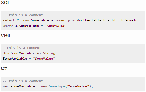
CodeReview Syntax Highlighting

Actual

In VS2012 Express, without any customization, code is highlighted like this:

VS2012E /C# highlighting

In SSMS2012 Express, without any customization, TSQL is highlighted like this:

enter image description here

I think I made my point: I don't mind gray comments (although I don't see a reason why they shouldn't be showing up in green), but blue should be blue, and red could be a little bit brighter (SSMS2012 is a little bit intense, but somewhere between that and VS2012 would be perfect).


Update

Inspecting the CSS with FireBug is quite interesting - it seems the color for the "kwd" class is intended to be #00008B (blue), but that gets overwritten by #8A4A0B (mud-brown), so fixing the colors is - as I thought - pretty easy; just by disabling the overwriting CSS rules and using #008B00 for comments, I get it to look like this:

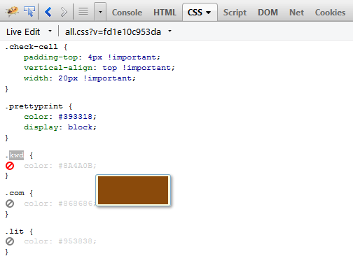
enter image description here

enter image description here

So the solution is essentially to remove the CSS rules that were added on top of the correct-looking ones. Come on guys, unless I missed something, effort is next to none here!

\$\endgroup\$
1
  • \$\begingroup\$ Or maybe I need better glasses? \$\endgroup\$ Commented Nov 2, 2013 at 3:38

1 Answer 1

5
\$\begingroup\$

I agree with this, and in particular I find comments are hard to read — comments are just as important as code, but displaying them in grey on a grey background suggests that they are not important.

Good luck getting this improved, though: when I raised this issue previously I was told that it's my problem that I don't have perfect vision.

So what I do instead is to use the Stylish plug-in for Chrome, which allows me to apply a custom stylesheet to any website. For Stack Overflow I have, for example:

pre .com {color:black; font-style:italic;}
\$\endgroup\$
4
  • \$\begingroup\$ Ironically, it's just CSS and that's the whole point - changing mud-brown for blue shouldn't be a huge effort! \$\endgroup\$ Commented Nov 2, 2013 at 22:21
  • 1
    \$\begingroup\$ @retailcoder Would you be willing to do it (install Stylish, make and test the CSS file, and then suggest that it becomes official)? I expect this could make it much easier to be accepted than "we want change, please make it happen". :-) \$\endgroup\$ Commented Nov 3, 2013 at 3:56
  • \$\begingroup\$ @VedranŠego is opening up FireBug and finding the CSS rule that overwrites the correctly-looking .kwd class good enough? \$\endgroup\$ Commented Nov 3, 2013 at 17:13
  • 1
    \$\begingroup\$ @retailcoder I'd say that anything that produces wanted rules (i.e., requires just a copy/paste to be applied) is good enough. However, note that I'm an ordinary user, not the one who can apply this, so good enough for me may not be good enough for whoever should actually apply the change. \$\endgroup\$ Commented Nov 3, 2013 at 18:26

You must log in to answer this question.

Not the answer you're looking for? Browse other questions tagged .