What should our logo and site design look like?
-
2\$\begingroup\$ Thanks for bringing this topic up! It's always good to get an early start on design discussions. \$\endgroup\$– JinCommented Jan 20, 2011 at 21:34
-
\$\begingroup\$ Excellent question, however, asking a bunch of developers for design advice seems like a bad idea. I imagine most of us, myself included, can't design for shit. That being said, I do really like PleaseStand's logo idea. \$\endgroup\$– mseancoleCommented Oct 19, 2012 at 14:09
-
2\$\begingroup\$ wow, I just realized how old this thread was. Thought it was odd that it got so much attention so quickly... Either way, it was a good question. \$\endgroup\$– mseancoleCommented Oct 19, 2012 at 14:20
-
\$\begingroup\$ @mseancole Only because we develope, doesn't mean we can't design. ;) \$\endgroup\$– kleinfreundCommented Feb 2, 2014 at 12:45
-
\$\begingroup\$ There should be a dark skin for the site in my opinion. Much easier on the eyes! \$\endgroup\$– Henrik BohlinCommented Jan 16, 2015 at 0:28
-
\$\begingroup\$ I think that we should keep the Beta-Blue. (In some way). It's been around so long that it seems like a symbol of CR to me. \$\endgroup\$– Ethan BierleinCommented May 19, 2015 at 22:02
19 Answers
I looked through the major SE sites and their logos and noticed they're quite minimalistic. So I grabbed my sketch blog and a pen. This is what I came up with:

Update 1
- No more beta-blue
- Better angles for the breaks, so people actually figure out what the letters may be. :~)

Update 2
Based retailcoder's T-Shirt question

Update 3
Another T-Shirt question based thing

Update 4
As requested by Bobby, being pretty obvious:

Just playing around with more abstract drafts

-
9\$\begingroup\$ That magnifying glass looks like "CR"! \$\endgroup\$ Commented Jan 28, 2014 at 17:42
-
1\$\begingroup\$ I like the idea of a stylized magnifying class...would it be possible to put it into "Code Review"? \$\endgroup\$– BobbyCommented Feb 4, 2014 at 12:01
-
\$\begingroup\$ I asked because I think that keeping the name of the site would be beneficial and I'd really like to see if it can fit into the text "Code Review" (I'm unsure because of the "d"). The good thing is, the lens can be used to "mark" anything that comes out of Code Review (like you said the Weekend challenges). \$\endgroup\$– BobbyCommented Feb 4, 2014 at 12:13
-
\$\begingroup\$ @Bobby You mean something like "C[q]de Review" (with [q] being the magnifier)? I also thought about making a variatione where "Code" is written as the lense. The "C" and "O" are visible, the "D" is there as well, just the "E" would need something extra. \$\endgroup\$ Commented Feb 4, 2014 at 12:17
-
\$\begingroup\$ Yes, that was my idea. Your idea also sounds interesting. \$\endgroup\$– BobbyCommented Feb 4, 2014 at 12:27
-
\$\begingroup\$ @Bobby See my latest edit. Hope you like it. \$\endgroup\$ Commented Feb 5, 2014 at 15:50
-
\$\begingroup\$ Yes, I like it. That's exactly what I meant. I think that's awesome, very well done. \$\endgroup\$– BobbyCommented Feb 5, 2014 at 17:44
-
\$\begingroup\$ There may be a way to make the "CR" more obvious: remove "Review" from the first line, and add "eview" on the second line. Possibly remove the initial 'C', and add a circle (i.e. 'O') inside the magnifying glass. \$\endgroup\$– ChrisWCommented Feb 6, 2014 at 11:26
-
\$\begingroup\$ @ChrisW Thank you for the suggestions. I tried adding an 'o' or circle inside the magnifying glass, but that kind of ruined the original idea of my logo. I try it again and maybe add something to the answer. :) \$\endgroup\$ Commented Feb 6, 2014 at 16:12
-
\$\begingroup\$ Maybe if the 'O' were the same font size as "DE", then the 'C' and 'R' could be bigger (than all the other letters). I don't think it will necessarily work as an idea; just an off-the-wall idea. The R will make the kerning between the O and the D look awkward (bigger than the kerning between the D and E). \$\endgroup\$– ChrisWCommented Feb 6, 2014 at 16:19
-
\$\begingroup\$ @ChrisW Yep, getting a working kerning is a bit tricky. I don't want to change the angle of the handle. I'll find some time on the weekend. You can ping me in the chat, if you want to discuss. \$\endgroup\$ Commented Feb 6, 2014 at 16:27
-
-
\$\begingroup\$ I personally like the second but last Image the best. It might look even better with the 'v' of review changed to a majuscle lambda: "Code ReΛiew", also in orange ;) \$\endgroup\$– Vogel612Commented Sep 30, 2014 at 16:13
-
\$\begingroup\$ In the last one, how would it look with eview added after the R embedded in the o? I'm thinking that it would be underneath the DE. \$\endgroup\$– BrythanCommented Oct 16, 2014 at 1:50
-
\$\begingroup\$ @Brythan Yeah, possibly. Currently I don't have much time on my hands to redo some of these. If there are more requests I surely will find some spare time, though. :) \$\endgroup\$ Commented Oct 16, 2014 at 16:21
A magnifying glass on top of some bad code?

If anyone is wondering, the code behind the magnifying glass is:
#include <stdio.h>
int main() {int n=101, x; for(x=0;++x<n;)
printf(!(x % 15) ? "FizzBuzz\n" : !(x %
3) ? "Fizz\n" : !(x % 5) ? "Buzz\n" : "%d
\n", x); return 0;}
-
\$\begingroup\$ +1 this one's pretty good too. idealmachine has a similar idea to mine \$\endgroup\$ Commented Jan 21, 2011 at 4:37
-
1\$\begingroup\$ May be good to have green writing on a dark background. with this general idea. \$\endgroup\$– AthasCommented Jan 21, 2011 at 8:26
-
\$\begingroup\$ Don't like the sound of green, maybe some kind of stylish syntax highlighting, and a different colour for the top layer of text. \$\endgroup\$ Commented Jan 27, 2011 at 10:55
-
2\$\begingroup\$ @Wes, Physics.SE had a dark background for a while and had to revert due to usability issues. I visited a few times while they had the dark background and found it to be a strain on the eyes. I would prefer Code Review not go down that path. \$\endgroup\$ Commented Mar 12, 2011 at 8:21
-
\$\begingroup\$ @idealmachine: Posted feedback to the use of a "magnifying glass" as visual icon within my answer here: meta.codereview.stackexchange.com/questions/70/… \$\endgroup\$– blundersCommented Mar 26, 2011 at 15:40
-
\$\begingroup\$ +1 @Brian Reichle: Agree, black is bad as a background. \$\endgroup\$– blundersCommented Mar 26, 2011 at 15:41
-
3\$\begingroup\$ I really like this idea, but the magnifying glass looks a little awkward. The handle seems skewed and is too long for the size of the lens. BTW: Is that a fisheye effect for the "lens" or are my eyes deceiving me? If it is, that's a nice touch, if not then that's a great illusion. \$\endgroup\$ Commented Oct 19, 2012 at 14:18
-
5\$\begingroup\$ I like this logo, but also think the
codeReview();should be replaced with something more OOP (I know, it's a bias), but how aboutcode.review();as suggested by @retailcoder here: meta.codereview.stackexchange.com/a/1209/31503 \$\endgroup\$– rolflCommented Dec 3, 2013 at 15:23 -
\$\begingroup\$ Great code! Very readable and clean. Maybe replace the magic number in
x % 15withx % (3 * 5)to make it perfect. \$\endgroup\$ Commented Feb 7, 2014 at 1:52
I kind of like the idea of a pseudocode block being worked into the logo somehow. Something like this:
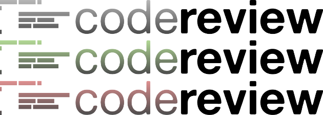
EDIT: See below.

I don't know how to feel about the magnifying glass, but I included it just for fun.
-
\$\begingroup\$ +1 @65Fbef05: For being a real logo, very cool. It's not clear if that's one logo, or three versions of a logo. The abstract blocks for text are nice, but in my opinion could be clustered a little more to make it more of a stand alone icon. \$\endgroup\$– blundersCommented Mar 26, 2011 at 15:55
-
\$\begingroup\$ It's three versions - I wanted to see what it would look like in different colors. Are you thinking more clustered as in equal x and y dimensions (ie. a square instead of a rectangle)? \$\endgroup\$– 65Fbef05Commented Mar 28, 2011 at 3:11
-
1\$\begingroup\$ I really like the bottom one in your edit, the magnifying glass is a really nice touch. \$\endgroup\$ Commented Mar 22, 2013 at 8:01
I'm thinking of a more sober design, something like this:

First of all I really like kleinfreund's magnifying glass idea. However I think, that as programmers.SE has a logo that is not that serious, even a little funny, the coffee mug, the same could apply to codereview.SE.
So what do you think about the famous code reviewing rubber duck?

I am by no means a graphics designer, so please evaluate this only as an idea, and not as a final logo suggestion :)
-
8\$\begingroup\$ I love it! (But am admittedly biased...) \$\endgroup\$ Commented Feb 16, 2015 at 0:24
-
2\$\begingroup\$ Biased as well, but yeah, absolutely - this is an awesome idea! \$\endgroup\$ Commented Feb 16, 2015 at 0:34
-
\$\begingroup\$ Looks good. Go for it. \$\endgroup\$– user34073Commented Feb 16, 2015 at 0:39
-
\$\begingroup\$ Love it! Just not as the logo for CR... \$\endgroup\$– janosCommented Feb 16, 2015 at 6:12
-
5\$\begingroup\$ I like the idea, but to me rubber duck says "debugging", not "review", and the former is definitively not on-topic; this could lead to confusion. \$\endgroup\$ Commented Feb 22, 2015 at 15:34
Code block formatting
@JeroenVannevel posted in The 2nd Monitor a screen capture from someone's IDE and code that I think looks really sharp and sexy, and makes code reading easier on the eyes:

Or maybe at least make it look like one of the popular IDEs (Visual Studio shown):
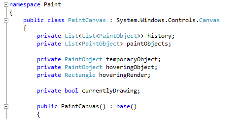
Compare to our current code blocks:

That brown-turquoise-on-grey just isn't very attractive. Would it be possible to prettify our code blocks a bit as such?
Edit 2014-10-31
-
\$\begingroup\$ Well, stack exchange uses google prettify, so I would think these themes are available. Desert looks pretty close to what you've shared. I'm a fan of this. \$\endgroup\$ Commented Oct 31, 2014 at 18:37
Colors
I may get lynched for this, but "beta blue" has become part of our identity after being in beta for so long. I personally like the the idea of keeping just a splash of it around. It shouldn't be the primary color, but it would be a nice accent.
I really like some of the logos kleinfreund came up with, but gray and orange are StackOverflow's colors. We've very little in common with SO and I don't think we should be using their colors.
BlockQuotes
Please, please, please, leave blockquote formatting alone. StackOverflow and Meta's blockquotes don't differentiate enough between a code block inside of a blockquote and a regular code block. The yellow background on Code Review's makes it very easy to visually tell the difference. It doesn't have to be yellow, but the background should be a differnt color.
StackOverflow:

Code Review:

Update 1/20/15:
As of 1/16/15 or so, it looks like SO no longer has the gray on gray quote blocks, so hopefully we don't have to worry about this.
-
\$\begingroup\$ Won't every beta site have the same feeling of connection to the beta blue? \$\endgroup\$– nhgrifCommented May 5, 2015 at 15:08
-
1\$\begingroup\$ Sure @nhgrif. Probably, but how many spend 3+ years with the beta blue? I don't think it should be the primary color. Just an accent. \$\endgroup\$ Commented May 5, 2015 at 15:09
I had some free time (No actually it's 2:56 AM, way past my bed time). So I whipped this up (Not a logo,but a wallpaper).
btw I'm not a graphic designer. But I know how to Google. :D
Download
Preview
Version 1

Version 2

Version 3

PS : See if you can find your username in there.
BACKGROUND: I've designed easily 2000+ logos; meaning paid, not on my free time.
Have a few ideas, but my suggestion would be to focus on and agree on the "feel" the logo should have, and the message that it's sending.
FEEL: Techie, Fresh, ...
MESSAGE: Dialog, Community, Code, Clear
VISUAL: In terms of a visual, I image comments bubble "talking" to each other and/or point to a block code of lines that appears to be text.
FEEDBACK:
- A "magnify glass" is old school, and may come off as being overly critical, singular, and a closed loop form of analysis.
- "Glasses" might appear weak, and are also old school.
I came up with this basic idea and thought I would raise the topic myself, clearly everyone else is way ahead of me :)


-
10\$\begingroup\$ has to say "WTF" though :) \$\endgroup\$ Commented Mar 16, 2011 at 5:45
-
6\$\begingroup\$ @Jeff Artwood: I just thought it would be nice to put the site name in the logo, but I suppose we could call the site wtf.stackexchange.com :) \$\endgroup\$ Commented Mar 16, 2011 at 7:08
-
2\$\begingroup\$ +1 "WTF!" ...mainly just because it's super funny, and gets away from the "dry" nature of peer review in most places. \$\endgroup\$– blundersCommented Mar 26, 2011 at 15:50
-
\$\begingroup\$ +1 @Brian Reichle I really like the idea of a new site at wtf.stackexchange.com - could be a catch all for migrating aneurism-inducing posts. \$\endgroup\$– 65Fbef05Commented May 13, 2011 at 21:41
Two people crouched over a computer... silhouette style.
-
7\$\begingroup\$ it's so ... romantic! swoons \$\endgroup\$ Commented Mar 16, 2011 at 5:45
-
\$\begingroup\$ silhouettes usually don't have a modern feel to them, though agree it's topic as a message and visual, \$\endgroup\$– blundersCommented Mar 26, 2011 at 15:48
          _____                    _____
         /\    \                  /\    \
        /::\    \                /::\    \
       /::::\    \              /::::\    \
      /Python\    \            /Scala:\    \
     /:::/\:::\    \          /:::/\:::\    \
    /:::/  \:::\    \        /:::/__\:::\    \
   /:::/    \:::\    \      /Ruby\   \:::\    \
  /:::/    / \:::\    \    /::::::\   \:::\    \
 /:::/    /   \:::\    \  /:::/\:::\   \:::\____\
/dot/____/     \net\____\/:::/  \:::\   \:::|    |
\:::\    \      \::/    /\::/   |Java\  /:::|____|
 \:::\    \      \/____/  \/____|:::::\/:::/    /
  \:::\    \                    |:::::::::/    /
   \VBA\    \                   |::|\C++:/    /
    \:::\    \                  |::| \::/____/
     \PHP\    \                 |::|  ~|
      \:::\    \                |::|   |
       \:::\____\               \::|   |
        \C#/    /                \:|   |
         \/____/                  \|___|
Add/remove the languages if you prefer.
-
\$\begingroup\$ I don't think "Brainfuck" will fit... \$\endgroup\$ Commented May 5, 2015 at 14:36
-
5\$\begingroup\$ @SimonAndréForsberg it does.. directly above C++ \$\endgroup\$– Vogel612Commented May 5, 2015 at 14:37
-
2\$\begingroup\$ yeah, let's just put a big swear word in our logo and get blocked by all sorts of website filters. wait a second, no let's not do that. \$\endgroup\$– MalachiCommented May 5, 2015 at 15:39
-
3\$\begingroup\$ HOLY CARP!! You're an ASCII art ninja!! \$\endgroup\$ Commented May 5, 2015 at 16:27
-
\$\begingroup\$ @Mat'sMug not really, pretty good sites for ;) \$\endgroup\$ Commented May 5, 2015 at 17:11
-
\$\begingroup\$
dot____net:.netpeeps, where is your deity now :p \$\endgroup\$– h.j.k.Commented May 6, 2015 at 9:43
Maybe a yellow highlighter pen? It suggests syntax highlighting and focus... I find the glasses metaphor a little long in the tooth :)
-
1\$\begingroup\$ I'd like that for a favicon. \$\endgroup\$– Michael K ModCommented Mar 11, 2011 at 18:05
-
\$\begingroup\$ +1 @pat: re: "glasses metaphor [is] little long in the tooth (that being, out dated)"... I completely agree. As for the "yellow highlighter pen", that says focus to me -- which while related to peer review, likely does not send a complete and/or clear message. For additional info, see my answer: meta.codereview.stackexchange.com/questions/70/… Cheers! \$\endgroup\$– blundersCommented Mar 26, 2011 at 18:52
First image that pops up in my mind when I hear code review is this:

P.S.: I know the image itself is not that suitable for the logo, but I wanted to share the idea.
-
5\$\begingroup\$ This is not a positive message. It'd be like having a fat person as the icon for a fast food place, not the message you want to send... or at least in my opinion. That said, the image is on topic, and does speak to the idea of code review. Cheers! \$\endgroup\$– blundersCommented Mar 26, 2011 at 15:44
-
\$\begingroup\$ I both like the idea and agree with blunders... :-) \$\endgroup\$– PhiLhoCommented Jun 1, 2011 at 11:52
When I think of a code review, I think of a meeting room and a projector. I have absolutely no idea how that could be conveyed in a web site design, but just throwing that out there.
I'm thinking LOC's(lines of code) with glasses over them. Something like this:

-
2\$\begingroup\$ this make me think on matrix \$\endgroup\$ Commented Jul 29, 2011 at 22:23
I'm thinking the letters CR, or 'Code Review' with the CR letters artfully accentuated with editing beziers
Here are some examples of the style
A good logo would be a group of people's shadow outline with their backs turned towards the viewers(us) and a colored in guy showing his code to the anonymous crowd.
